Wide-and-Loose Price Structures Are Failure Prone And Real Examples
Wide-and-loose-looking charts usually fail but can tighten up later. New England Nuclear and Houston Oil & Minerals are two cases of stocks that tightened up following wide, loose, and erratic price movements. I cite them because I missed both of them at the time. It’s always wise to review big winners that you missed to find out why you didn’t recognize them when they were exactly right and ready to soar.
New England Nuclear formed a wide, loose, and faulty price pattern that looked like a double bottom from points A, B, C, D, and E. It declined about 40% from the beginning at point A to point D. That was excessive, and it took too much time—almost six months—to hit bottom. Note the additional clue provided by the declining trend of its relative strength line (RS) throughout the faulty pattern. Buying at point E was wrong. The handle was also too short and did not drift down to create a shakeout. It wedged up along its low points.
New England Nuclear then formed a second base from points E to F to G. But if you tried to buy at point G, you were wrong again. It was premature because the price pattern was still wide and loose. The move from point E to point F was a prolonged decline, with relative strength deteriorating badly. The rise straight up from the bottom at point F to the bogus breakout point G was too fast and erratic, taking only three months. Three months of improving relative strength versus the prior 17 months of decline weren’t enough to turn the previous poor trend into a positive one.
The stock then declined from point G to point H to form what appeared to be a handle area for the possible cup formation from points E to F to G. If you bought at point I on the breakout attempt, the stock failed again. Reason: the handle was too loose; it degenerated 20%. However, after failing that time, the stock at last tightened up its price stmcture from points I to J to K, and 15 weeks later, at point K, it broke out of a tight, sound base and nearly tripled in price afterwards. Note the stock’s strong uptrend and materially improved relative strength line for 11 months from point K back to point F.
So, there really is a right time and a wrong time to buy a stock, but understanding the difference requires some study. There’s no such thing as being an overnight success in the stock market, and success has nothing to do with listening to tips from other people or being lucky. You have to study and prepare yourself so that you can become successful on your own with your investing. So make yourself more knowledgeable. It isn’t easy at first, but it can be very rewarding. Anyone can learn to do it. You can do it. Believe in your ability to learn. Unlearn past assumptions that didn’t work.
Here are some faulty wide-and-loose patterns that faked people into buying during the prolonged bear market that began in March 2000: Veritas
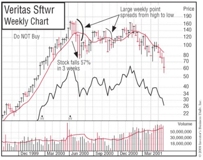
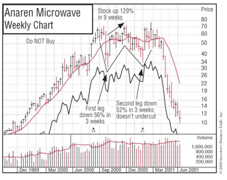

Software on October 20, 2000; Anaren Microwave on December 28, 2000; and Comverse Technology on January 24, 2001.
The aforementioned Houston Oil & Minerals is an even more dramatic example of the handle correction from point F to point G being a wide-and-loose pattern that later tightened up into a constmctive price formation (see the accompanying chart). A to B to C was extremely wide, loose, and erratic (the percent decline was too great). B to C was straight up from the bottom without any pullback in price. Points C and D were false attempts to break out of a faulty price pattern, and so was point H, which tried to break out of a wide-and-loose cup with handle. Afterward, a tight nine-week base formed from points H to I to J. (Note the extreme volume dry-up along the December 1975 lows.)
An alert stockbroker in Hartford, Connecticut, called this stmcture to my attention. However, I’d been so conditioned by the two prior years of poor price patterns and less-than-desirable earnings that my mind was slow to change when the stock suddenly altered its behavior in only nine weeks. I was probably also intimidated by the tremendous price increase that had occurred in Houston Oil in the earlier 1973 bull market. This proves that opinions and feelings are frequently wrong, but markets rarely are.
It also points out a very important principle: it takes time for all of us to change opinions that we have built up over a substantial period. In this instance, even the current quarterly earnings turning up 357% after three down quarters didn’t change my incorrect bearish view of the stock to a bullish one. The right buy point was in January 1976.
In August 1994, PeopleSoft repeated the New England Nuclear and Houston Oil patterns. It failed in its breakout attempt from a wide, loose, wedging- upward pattern in September 1993. It then failed a second time in its breakout attempt in March 1994, when its handle area formed in the lower half of its cup-with-handle pattern. Finally, when the chart pattern and the general market were right, PeopleSoft skyrocketed starting in August 1994.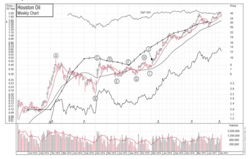

In the first week of January 1999, San Diego-based Qualcomm followed PeopleSoft’s three-phased precedent. In October 1997, Qualcomm charged into new-high ground straight up from a loose, faulty base with too much of its base in its lower half. It then built a second faulty base, broke out of a handle in the lower part, and failed. The third base was the charm: a properly formed cup with handle that worked in the first week in January 1999. Qualcomm went straight through the roof from a split-adjusted $7.50 to $200 in only one year. Maybe you should spend more time studying historical precedents. What do you think? If you had invested $7,500 in Qualcomm, a year later it would have been worth $200,000.
Detecting Faulty Price Patterns and Base Structures
Unfortunately, no original or thorough research on price pattern analysis has been done in the last 78 years. In 1930, Richard Schabacker, a financial editor of Forbes, wrote a book, Stock Market Theory and Practice. In it he discussed many patterns, including triangles, coils, and pennants. Our detailed model building and investigations of price stmcture over the years have shown these patterns to be unreliable and risky. They probably worked in the latter part of the “Roaring ’20s,” when most stocks ran up in a wild, climactic frenzy. Something similar happened in 1999 and the first quarter of 2000, when many loose, faulty patterns at first seemed to work, but then failed. These periods were just like the Dutch tulip bulb craze of the seventeenth century, during which rampant speculation caused varieties of tulip bulbs to skyrocket to astronomical prices and then crash.
Our studies show that, with the exception of high, tight flags, which are extremely rare and hard to interpret, flat bases of five or six weeks, and the square box of four to seven weeks, the most reliable base patterns must have a minimum of seven to eight weeks of price consolidation. Most coils, triangles, and pennants are simply weak foundations without sufficient time or price correction to become proper bases. One-, two-, and three-week bases are risky. In almost all cases, they should be avoided.
In 1948, John McGee and Robert D. Edwards wrote Technical Analysis of Stock Trends, a book that discusses many of the same faulty patterns presented in Schabacker’s earlier work.
In 1962, William Jiler wrote an easy-to-read book, How Charts Can Help You in the Stock Market, that explains many of the correct principles behind technical analysis. However, it too seems to have continued the display and discussion of certain failure-prone patterns of the pre-Depression era.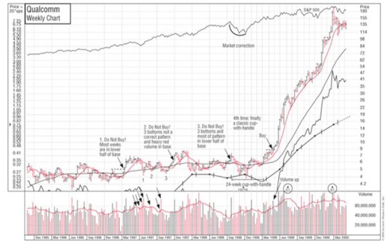
Triple bottoms and head-and-shoulders bottoms are patterns that are widely mentioned in several books on technical analysis. We have found these to be weaker patterns as well. A head-and-shoulders bottom may succeed in a few instances, but it has no strong prior uptrend, which is essential for most powerful market leaders.
When it comes to signifying a top in a stock, however, head-and-shoulders top patterns are among the most reliable. Be careful: if you have only a little knowledge of charts, you can misinterpret what is a correct head-and-shoulders top. Many pros don’t interpret the pattern properly. The right (second) shoulder must be slightly below the left shoulder (see the chart for Alexander & Alexander).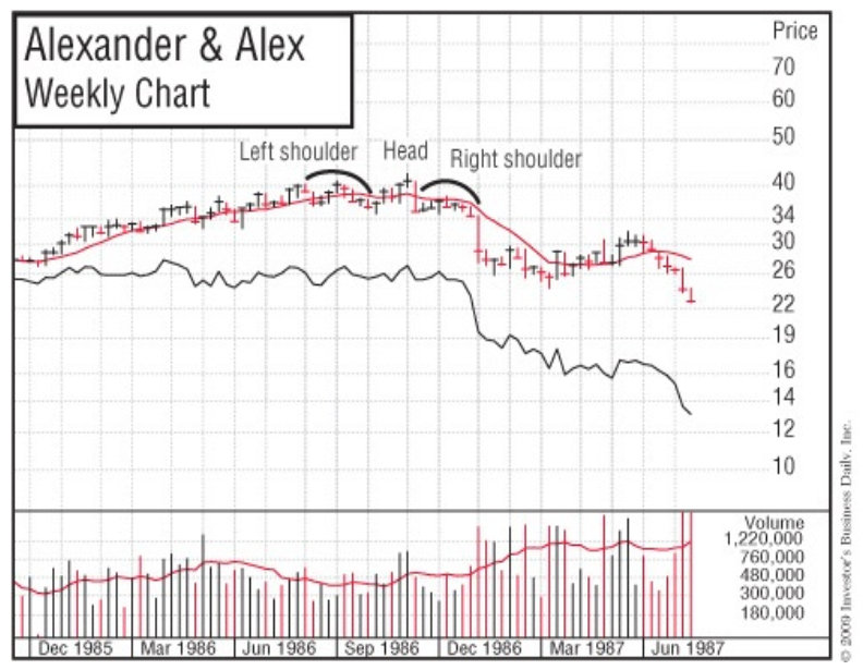
A triple bottom is a looser, weaker, and less-attractive base pattern than a double bottom. The reason is that the stock corrects and falls back sharply to its absolute low three times rather than twice, as with a double bottom, or once, as in the strong cup with handle. As mentioned earlier, a cup with a wedging handle is also usually a faulty, failure-prone pattern, as you can see in the Global Crossing Ltd. chart example. A competent chart reader would have avoided or sold Global Crossing, which later went bankmpt.
How to Use Relative Price Strength Correctly
Many fundamental securities analysts think that technical analysis means buying those stocks with the strongest relative price strength. Others think that technical research refers only to the buying of “high-momentum” stocks. Both views are incorrect.
It’s not enough to just buy stocks that show the highest relative price strength on some list of best performers. You should buy stocks that are performing forming better than the general market just as they are beginning to emerge from sound base-building periods. The time to sell is when the stock has advanced rapidly, is extended materially from its base, and is showing extremely high relative price strength. To recognize the difference, you have to use daily or weekly charts.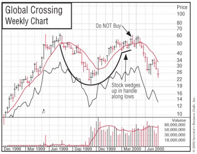
What Is Overhead Supply?
A critically important concept to learn in analyzing price movements is the principle of overhead supply. Overhead supply is when there are significant areas of price resistance in a stock as it moves up after experiencing a downtrend.
These areas of resistance represent prior purchases of a stock and serve to limit and fmstrate its upward movement because the investors who made these purchases are motivated to sell when the price returns to their entry point. (See the chart for At Home.) For example, if a stock advances from $25 to $40, then declines back to $30, most of the people who bought it in the upper $30s and at $40 will have a loss in the stock unless they were quick to sell and cut their loss (which most people don’t do). If the stock later climbs back to the high $30s or $40 area, the investors who had losses can now get out and break even.
These are the holders who promised themselves: “If I can just get out even, I will sell.” Human nature doesn’t change. So it’s normal for a number of these people to sell when they see a chance to get their money back after having been down a large amount.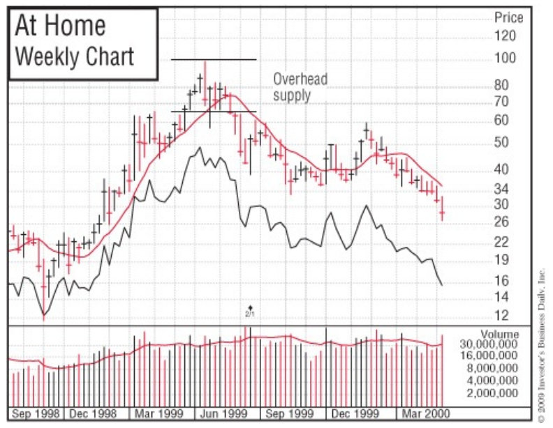
Good chartists know how to recognize the price zones that represent heavy areas of overhead supply. They will never make the fatal mistake of buying a stock that has a large amount of recent overhead supply. This is a serious mistake that many analysts who are concerned solely with fundamentals sometimes make.
A stock that’s able to fight its way through its overhead supply, however, may be safer to buy, even though the price is a little higher. It has proved to have sufficient demand to absorb the supply and move past its level of resistance. Supply areas more than two years old create less resistance. Of course, a stock that has just broken out into new high ground for the first time has no overhead supply to contend with, which adds to its appeal.
Excellent Opportunities in Unfamiliar, Newer Stocks
Alert investors should have a way of keeping track of all the new stock issues that have emerged over the last 10 years. This is important because some of these newer and younger companies will be among the most stunning performers of the next year or two. Most of these issues trade on the Nasdaq market.
Some new issues move up a small amount and then retreat to new price lows during a bear market, making a poor initial impression. But when the next bull market begins, a few of these forgotten newcomers will sneak back up unnoticed, form base patterns, and suddenly take off and double or triple in price if they have earnings and sales that are good and improving.
Most investors miss these outstanding price moves because they occur in new names that are largely unknown to most people. A charting service can help you spot these unfamiliar, newer companies, but make sure that your service follows a large number of stocks (not just one or two thousand).
Successful, young growth stocks tend to enjoy their fastest earnings growth between their fifth and tenth years in business, so keep an eye on them during their early growth periods.
To summarize, improve your stock selection and overall portfolio performance by learning to read and use charts. They provide a gold mine of information. It will take some time and study on your part to become good at this, but interpreting charts is easier than you think.
A Loud Warning to the Wise about Bear Markets!!!
Let me offer one last bit of judicious guidance. If you are new to the stock market or the historically tested and proven strategies outlined in this book, or, more importantly, if you are reading this book for the first time near the beginning or middle of a bear market, do not expect the presumed buy patterns to work. Most of them will definitely be defective. You absolutely do not buy breakouts during a bear market. Most of them will fail.
The price patterns will be too deep, wide, and loose in appearance compared to earlier patterns. They will be third-and fourth-stage bases; have wedging or loose, sloppy handles; have handles in the lower half of the base; or show narrow “V” formations moving straight up from the bottom of a base into new highs, without any handle forming. Some patterns may show laggard stocks with declining relative strength lines and price patterns with too much adverse volume activity or every week’s price spread wide.
It isn’t that bases, breakouts, or the method isn’t working anymore; it’s that the timing and the stocks are simply all wrong. The price and volume patterns are phony, faulty, and unsound. The general market is turning negative. It is selling time. Be patient, keep studying, and be 100% prepared. Later, at the least expected time, when all the news is terrible, winter will ultimately pass and a great new bull market will suddenly spring to life. The practical techniques and proven disciplines discussed here should work for you for many, many future economic cycles. So get prepared and do your homework. Create your own buy and sell rules that you will constantly use.


Leave a Reply